The COVID-19 Pandemic has taken its toll on all Australians. My small business has suffered dramatically, losing a number of very important clients in the first quarter of the pandemic.
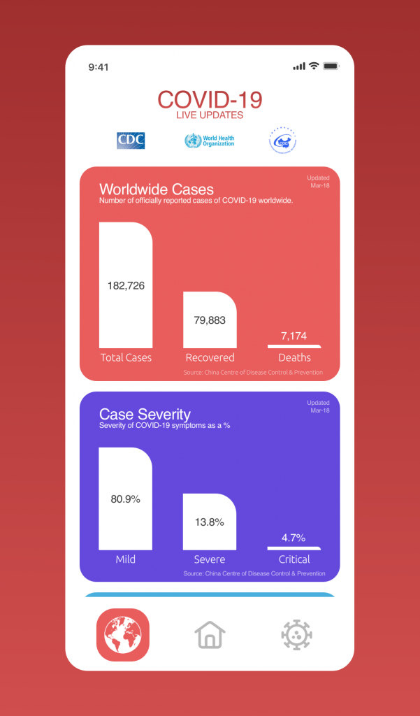
Due to this I did have some time on my hands and decided to sharpen my wire-framing and UX/UI skills and put together a Proof of Concept for a Covid-19 Live Update Mobile Application.
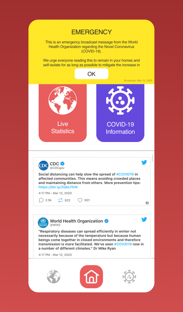
This product would feed live updates and data from authorities back to end-users and would allow for push notifications to be issued for updates that are not deemed important enough to meet ‘Emergency Broadcast’ protocols.
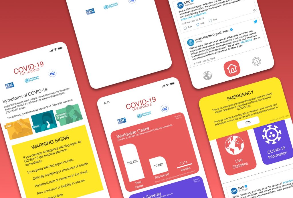
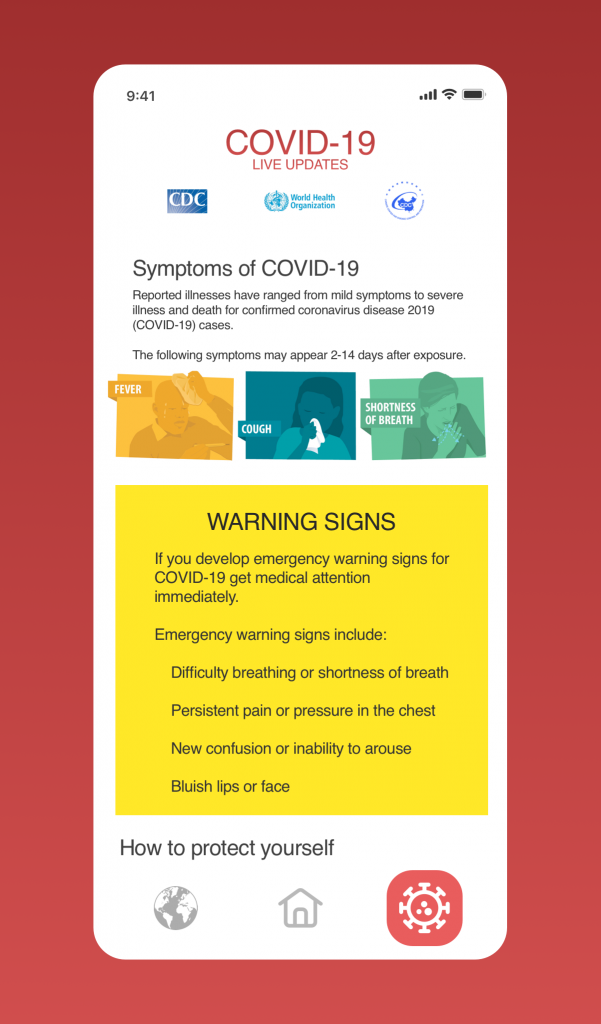
The concept of course being laid out as simple as possible to support users who are aged or otherwise technologically illiterate, as typically this demographic of people are the most effected by the virus.
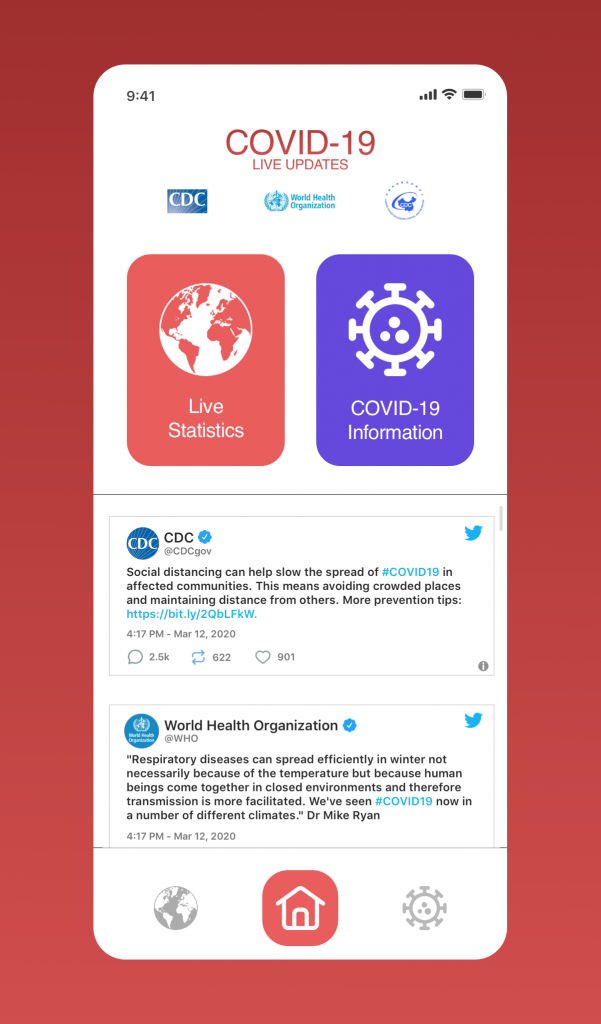
The product initially started out at 5 main pages and branched into multiple pages offering specific information about the virus. This was then refined down to 3 pages and streamlined to deliver information efficiency.
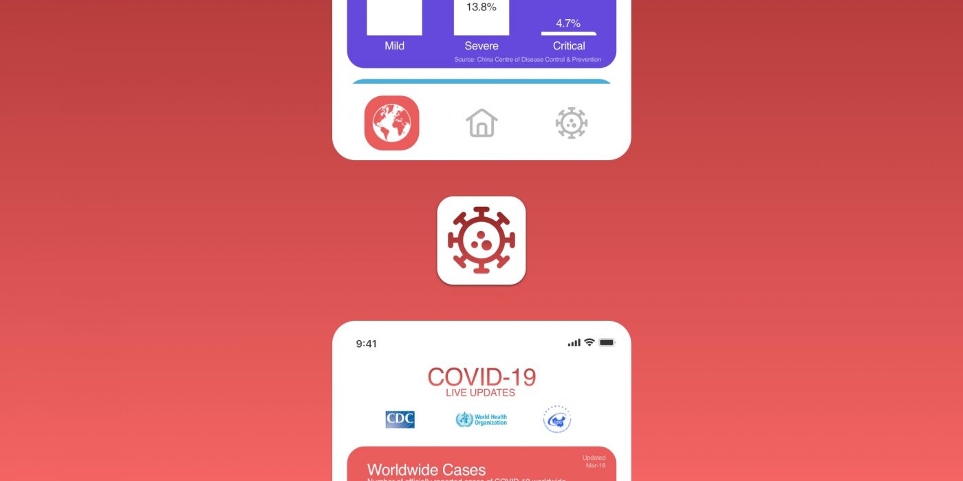
A decision was made to include an icon only menu bar, this ensures that translation can be conducted on the content of the application, specifically related to the pulling of data from worldwide agencies, while not negatively effecting the interface or the experience of the user.
By ensuring uniformity between language versions of the product, we can portray a sense of control, intelligence and trustworthiness, some ideas sadly lacking during the outbreak of the virus.

This product was designed with information consumption in mind, displaying data in a simple manner while sticking to the industry standard north-south scroll (cheers Instagram).
The contrasting colour palette draws the users attention to important information and a live twitter feed could be setup pulling the tweets from the major authorities on COVID19 in real-time.
