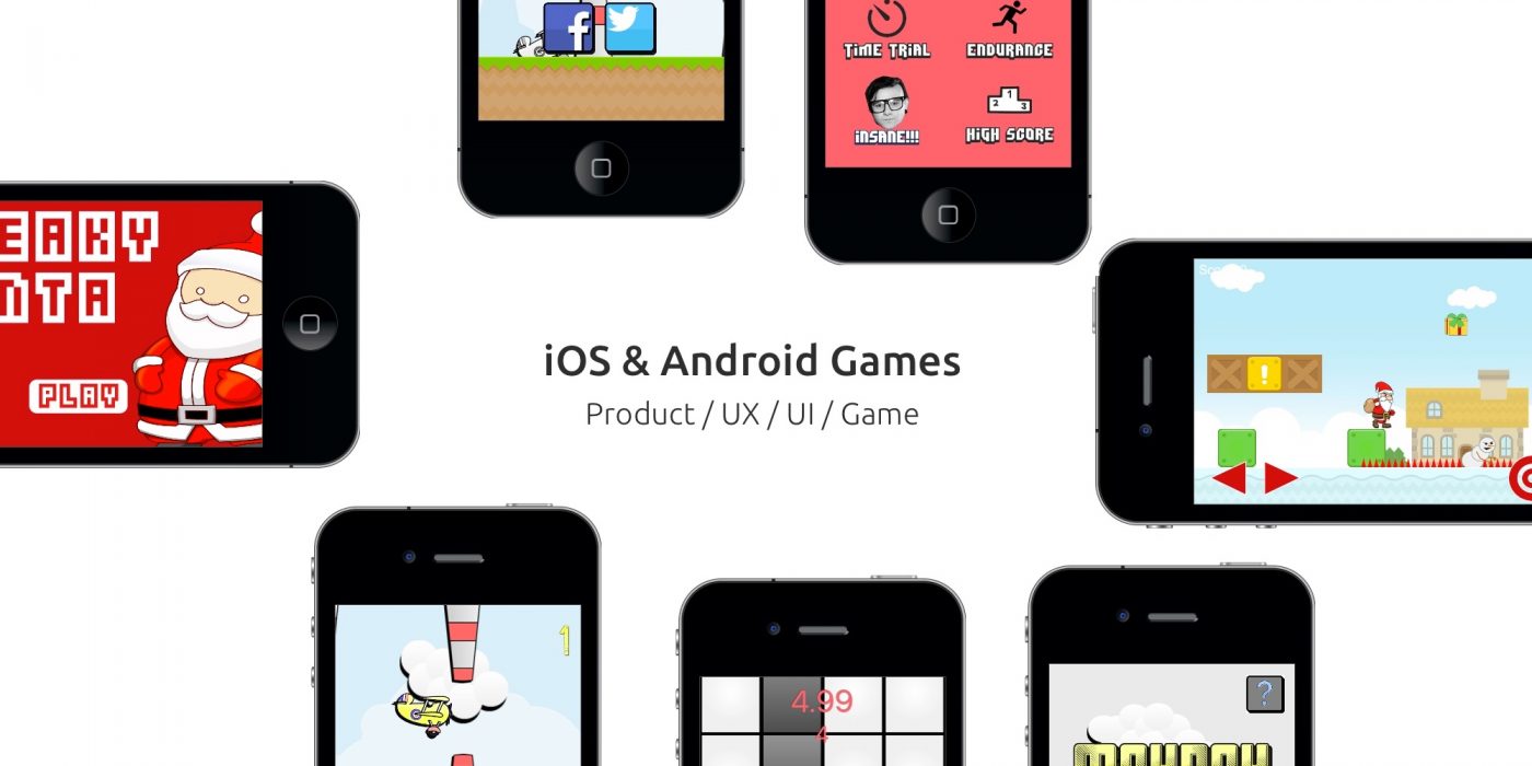
Over the past 10 years I have dabbled with game design and development as a hobby. Some of this dabbling has led to experience gained, some led to business opportunities, some led to the acquiring of new skills or the levelling up of old skills, and some led to the design and development of some fun arcade mobile games.
Be it the creation of game design documents, level design, tweaking of difficulties, coding user interfaces, creating game assets or making meaningful changes based on analytical user data, I have been through the hills and valleys of designing and releasing indie games on the App store’s.
Below I will showcase some of the games I have worked on over the past decade, but it is worth noting that these ‘titles’ were released prior to 2015. Post 2015 was where I focused on the intricacies of Product, UX and UI design and have not had the opportunity to return to the realm of game design though it remains my passion.
Mayday
Designed and developed on the back of ‘Flappy Bird’s’ outrageous success, I decided to strike while the iron was hot and get a game out the door that might just be caught up in the whirlwind of its success.
Analysis
I analysed Flappy Bird’s overnight success by examining downloads, reviews, and social media mentions. I tracked the game’s ranking using online tools and noticed a trend. Before its late 2013 success, there was a download spike followed by a slump, typical of new indie game launches.
The major boost in downloads and social media mentions in November caught my attention. Most social media activity centred around App Store reviews, with an impromptu competition for the funniest review spreading on Twitter.
While possibly coincidental, I believe Dong Nguyen manufactured this through clever UX and UI design. The game’s difficulty meant players frequently saw the ‘Game Over’ screen. Nguyen used this for ad impressions and to drive traffic to the App Review page, something mobile users rarely seek out.
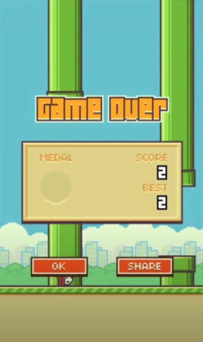
It would appear that through the difficulty of the game, along with the unique 90’s style assets and some intelligent UX work, Dong primed his app to become a perfect storm and all he really needed was a catalyst, which turned out to come from the millions of end-users who thought it would be funny to post ridiculous reviews.
Though the catalyst would be based on pure luck, there is no doubt that Dong’s design decisions manufactured the mechanisms allowing his product to hit the levels of fame it gained.
Design
I then focused on the game’s design. While largely copying the original, I created a design document with wireframes and sketches.
Key design decisions were needed, considering platform limitations. I debated level design: a repeating X-pixel level, infinitely generating barriers, or creating barriers in batches based on user position.
I chose to create the level in blocks based on user position. This allowed lazy loading, reducing load times, and ensured each playthrough was unique due to randomly generated barriers.
The ‘Game Over’ menu was crucial. Based on my research, we included buttons for ‘Try Again’, ‘Rate’, ‘Return to Menu’, ‘Post Results to Facebook’, and ‘Post Results to Twitter’.
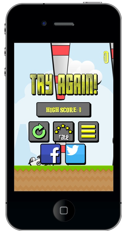
Mayday was launched with full analytics using Flurry to track which buttons end users would tap, the frequency of these taps vs. the times the ‘Game Over’ screen was seen. The end results were that some of these buttons were completely unused. As such a I decided to update Mayday and remove the unused buttons.
This resulted in more meaningful interactions and a higher clickthrough rate for the actions that were deemed important (sharing on social media).
Assets were a mix of purchased and created. At the time I was using Photoshop and Sketch to create PNG files for the game. Be gentle, it was one of my first dives into UI.
Development
The development of Mayday was done using the Lua coding language using an SDK called Corona (now Solar2D). An intuitive coding language with an even more intuitive SDK that would take the single batch of Lua documents, process them and offer back iOS and Android native mobile applications.
Development began while assets were being completed and Version 1.0 was pushed to both App store within a week.
Release
As I waited for downloads, user feedback and analytics to come through I began work on Version 1.5 – this version would have multiple levels, with new assets and an unlock mechanism to access them.
Version 2.0 had updated assets and tweaks to the source code for efficiency purposes.
Mayday was downloaded over 50,000 times across iOS and Android.
Dubstep
The design and marketing was simple – create a simple, one-touch game that was very difficult and use a name that could trick the App store algorithms.
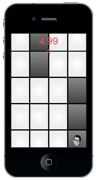
Dubstep is a ‘don’t touch the white tile’ game that would allow users to ‘create Dubstep’ inspired music by playing a sound every-time they touched a black tile. This was a very cheap, and honestly dirty, way of getting an App named Dubstep passed the scrutiny of Apple, but it did work.
Analysis
I conducted a trend analysis utilising the Apple App store data available through AppAnnie and noticed a trend pattern – one-touch games that were difficult was all the rage following the success of Flappy Bird. Due to this, I wanted to create something that was simple but addictive.
Design & Development
The design process was actually very straight forward, I didn’t even create a design document for this one. I ran a Game Dev Jam with my developer over 2 days and the end result was Dubstep.
All the assets were created in Adobe Photoshop and Sketch (except Skrillex’s face, I grabbed that from his Myspace page).
This was again developed in Lua using Corona SDK.
Release & Results
It was launched onto both Apple App store and Google Play store with surprising success, being a surprise hit in the Indian market and yielding over 1 million downloads.
Sneaky Santa Saves Christmas
I have always loved side-scrollers. Since getting my first ever game console in 1995 and going down to my local video store and borrowing copies of Streets of Rage 2, Golden Axe and Shinobi. But my favourite will always be Ranger X, it came bundled with the Sega Megadrive my Dad bought for me Christmas ’95.

With its stunning artwork, unique controls and a hovering motorcycle sidekick, it was just the coolest game. It was from my nostalgia for this genre of game that led me to make Sneaky Santa.
Wanting to release a game just prior to Christmas in order to catch incoming searches, and the attention of bored adolescents stuck at home over the break, I decided to create a simple, yet brutally difficult (near impossible to beat) side-scroller.
Design
Sneaky Santa was where I fell in love with design. I sketched out levels, designed choke points, and made functional decisions. It transformed from a necessary evil—just a way to communicate my ideas to a developer—into a journey I truly enjoyed.
blocks = {
			{
				filename = "images/block_grey_plain.png",
				type = "plain",
				widthHeight = {50,50},
				position ={0,276},
			},
Each level was meticulously crafted and fine-tuned to achieve pixel-perfect simplicity and difficulty, with careful attention to every gameplay detail. For instance, I initially coded in a double jump for Santa, but I was removed because it offered players an “unfair” second chance.
Development & Release
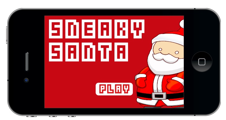
Sneaky Santa was coded in Lua on Corona SDK over one week and launched on the Apple and Google stores just before Christmas 2015.
The game received a great response in English-speaking countries, but those that didn’t celebrate Christmas found it less appealing. The difficulty curve garnered mixed feedback, and my marketing campaign on Reddit also had varied results. My hook was that it was the most challenging mobile game ever created, yet still possible, leading to thousands of downloads as users tried to beat the game and share their results.
However, in the following few hours, my game was downloaded, cracked, released it for free, my Facebook account was hacked, and I was doxxed — all while I watched it happen live.
Keepers
An unreleased and unrealised 2D side-scroller that I was very passionate about. I still might build it myself, someday.
This project had no analysis, it was a passion project. I created a detailed Game Design document which I will link below.
My final venture into mobile games (or games in general) marks the conclusion of Stage 1 in my career journey into UX/UI and Product.
I trust you’ve found this section of my portfolio engaging. While it showcases some of my more humbling moments, it’s essential to recognise that these experiences laid the groundwork for my expertise in UX/UI and Product. The seemingly modest games featured here provided a solid foundation for my skillset, shaping my comprehension of our craft’s demands, driving my analytical and design decisions, enhancing my collaboration with developers, and highlighting the immense effort required to create a successful product.
Though from humble beginnings…

