During my tenure as a Lead UX Designer at 10up I had the opportunity to design 15 Microsoft Cloud Marketing blogs, consisting of 3 net new blog properties and 12 blog redesigns totalling over a million monthly page-views between them.
Redesigns
Net New
Discovery
My role encompassed end-to-end UX design across all blog designs, engaging with the client and stakeholders early in the process was fundamental to the success of our discovery phase. I initiated this collaboration by organizing XD kickoff syncs with the internal team, where the project team aligned on project objectives, defined roles, and established a shared vision for the project.
Following kickoff, I took the lead in managing the UX and research planning. This involved developing a comprehensive strategy that encompassed user research methods, and workshop agendas. I designed and facilitated interactive workshops with the clients and stakeholders of each business unit that were crucial for uncovering user needs, identifying pain points, and brainstorming potential solutions.
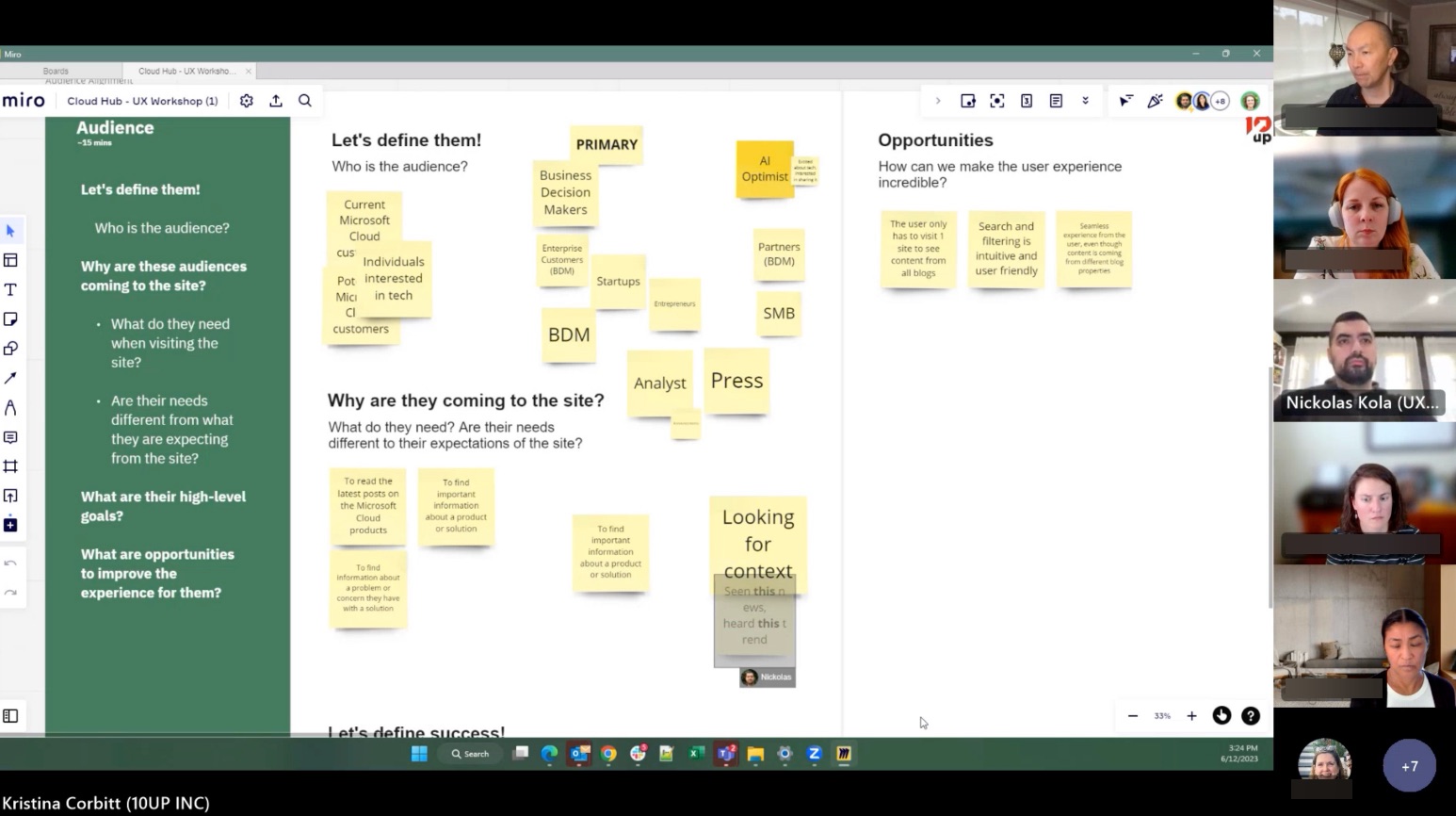
Screenshot of UX Workshop
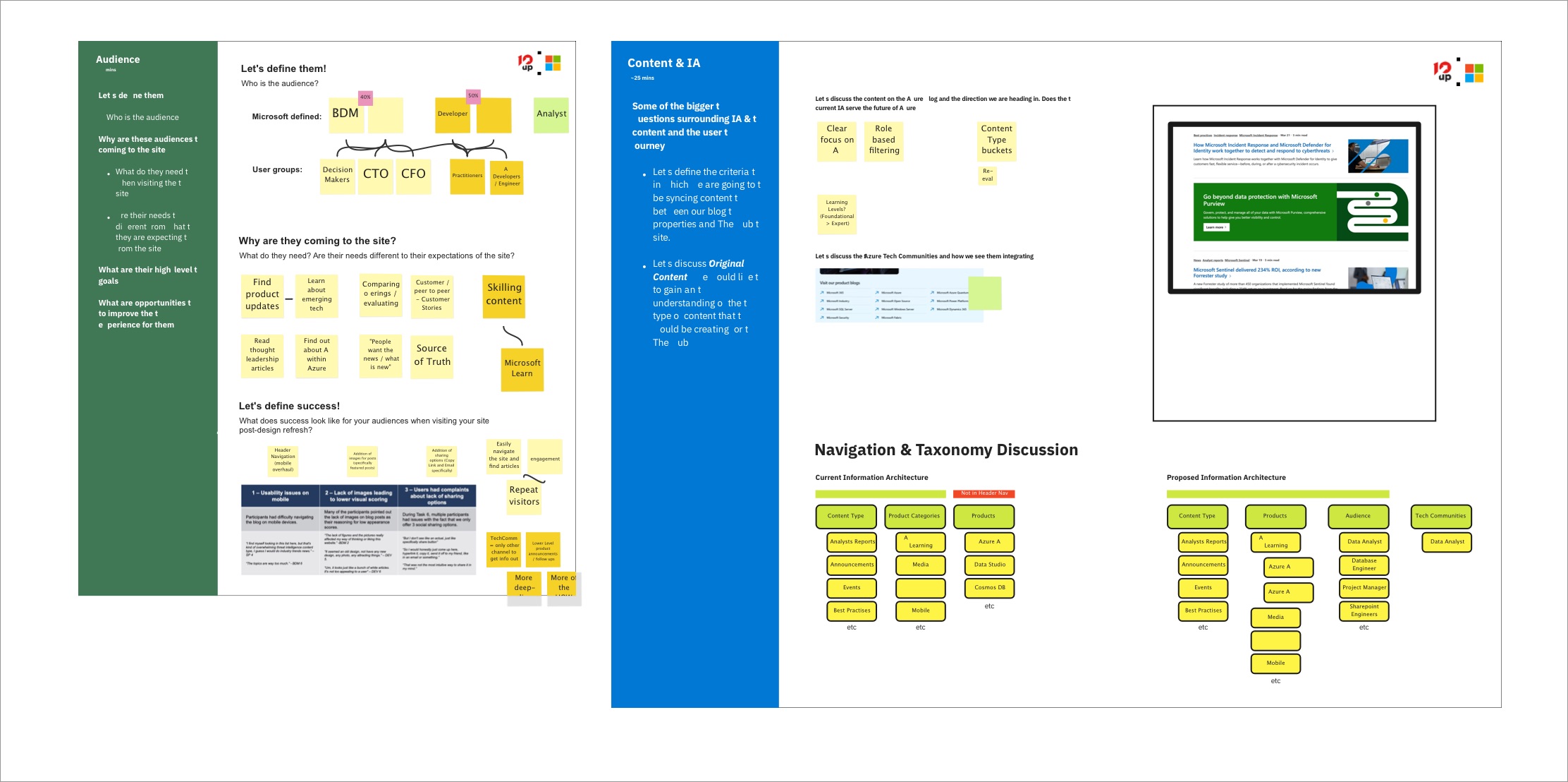
UX Workshop Miro Board
Information Architecture
Following the workshops, I focused on developing the information architecture (IA) for the blog. This involved a thorough analysis of the existing site’s content to understand what was currently available and how it was organized (for redesign project archetype).
I began by addressing several key questions: What content exists on the current site? This required a comprehensive inventory of all existing articles, categories, and tags to identify strengths and gaps.
Next, I explored the possibility of introducing new categories or taxonomies. Are there topics that were underrepresented or emerging themes that could enhance user engagement? This step was vital for ensuring our content strategy aligned with user interests, industry trends and UX best practises.
Lastly, mapping existing content into the new taxonomy terms. How could we effectively reclassify articles to fit the newly proposed structure? This involved not only considering the users mental model for a given blog and it’s content but also ensuring that users could intuitively navigate through these new taxonomies logically.

Information Architecture Design
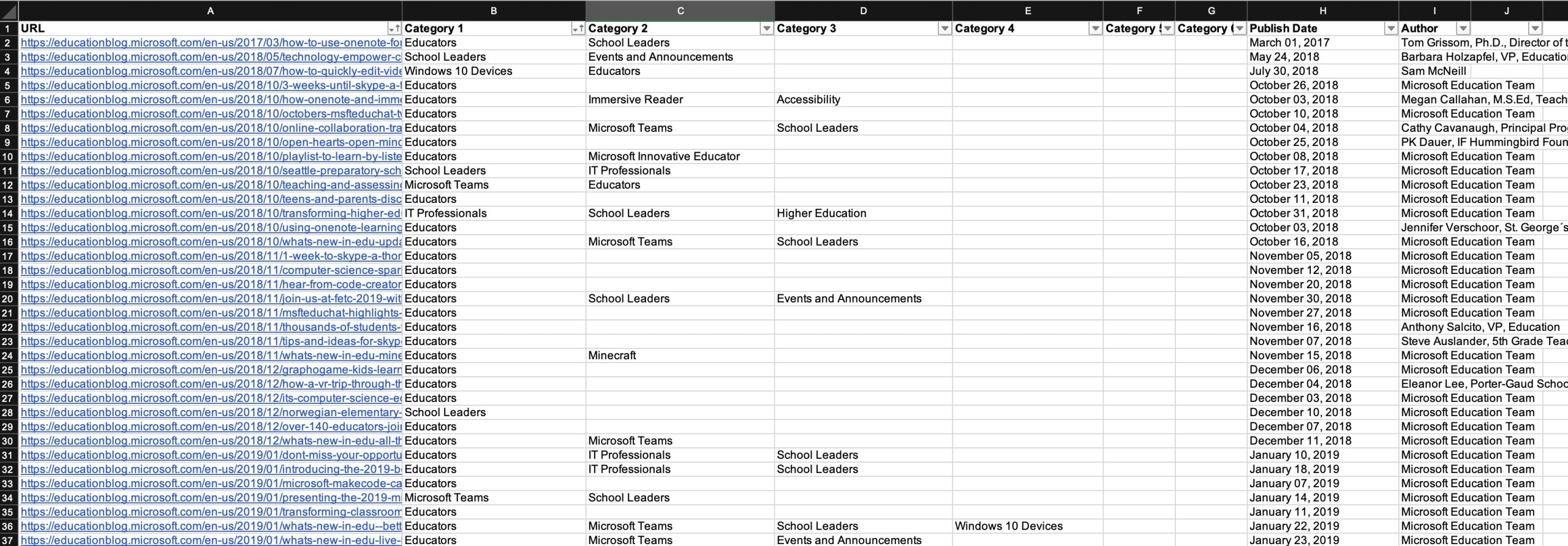
Information Architecture Mapping Document
Wireframes
Next, I moved into the iterative wireframing phase, which began with the creation of low-fidelity wireframes. These initial sketches allowed me to focus on layout and functionality without getting bogged down in visual design details. By organizing internal meetings with our team, I was able to review these wireframes collaboratively, discussing their viability and making necessary adjustments based on feedback.
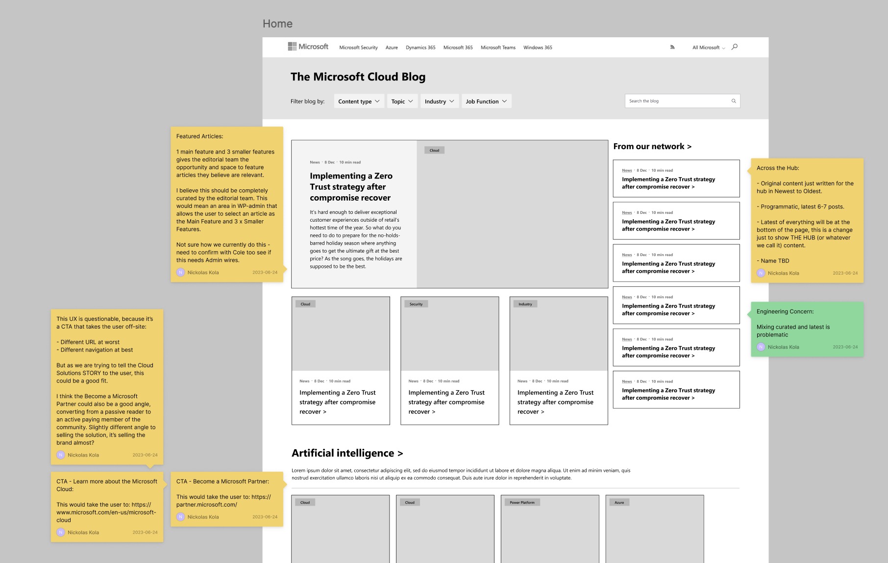
Early Low-fi Wireframes of the Microsoft Cloud Blog
Once the low-fidelity wireframes were refined and validated, I progressed to medium-fidelity wireframes. At this stage, I incorporated more detail, including the placement of text, images, and interactive elements. This was then shared with the client and stakeholder group and were typically very well received due to the robust discovery phase.
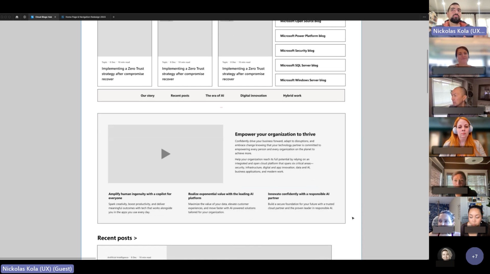
Wireframe presentation meeting with Microsoft stakeholders
Handover, Testing and QA
Following the approval of the wireframes, the project transitioned into the visual design phase. At this point, all design specifications and documentation were handed over to our talented visual design team, who worked to transform the wireframes into high-fidelity compositions.
Following this I was then tasked with developing a usability testing plan for each blog, this will be discussed in another portfolio item here:
In addition to usability testing preparation, I also took on the responsibility of quality assurance oversight. This involved reviewing the high-fidelity compositions against the approved wireframes and ensuring that all design elements were accurately represented. I collaborated closely with the visual design team and the development team to address discrepancies and ensure consistency across the user interface.
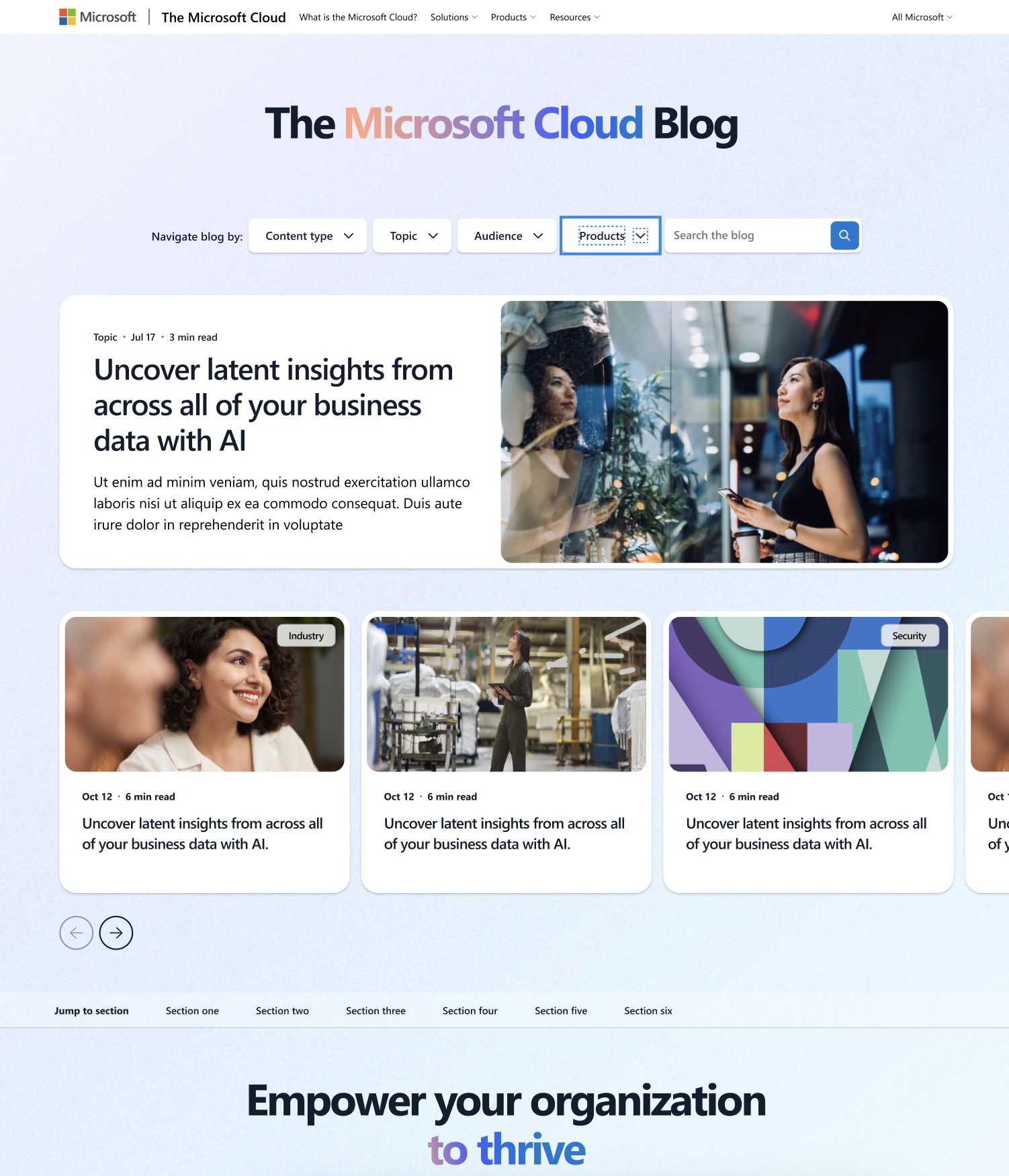
Final VD Comps of Microsoft Cloud Bog.
Final Words
I consider the work for this retainer, the 15 websites launched and over 100 localisations, one of my crowning achievements. In conjunction with the end-to-end design work conducted on these blogs was an enormous Usability Testing and Research project that I ran concurrently.
This website is live at https://www.microsoft.com/en-us/microsoft-cloud/blog/ and is considered the crown jewel of the Microsoft Cloud Marketing team due to it’s refreshing of the design system, benchmark usability scoring (SEQ, SUS, SUPRQ & NPS) and being a net new blog property.
