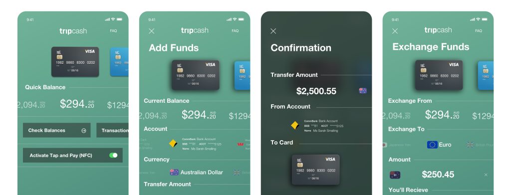
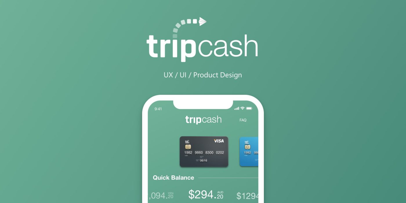
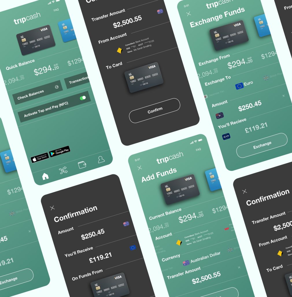
In 2016, I had the exciting opportunity to design the front-end consumer experience for Tripcash’s mobile application. Working within a dynamic startup environment with a flat structure, I transformed a stakeholder’s vision into a tangible product, a defining experience that I truly cherished.
Tripcash serves as a mobile wallet and funds transfer platform, enabling users to easily fund their accounts, execute real-time currency exchanges, and withdraw cash through Visa, MasterCard, and UnionPay networks—all while benefiting from low fees and competitive spreads.
At its core, Tripcash addresses a fundamental challenge: providing fast access to funds regardless of location, without incurring exorbitant fees.
Research
During the discovery phase, I facilitated initial conceptualization meetings with stakeholders to gather insights and align on project goals. This was followed by a series of collaborative workshops where ideas were brainstormed and refined our approach. I conducted competitive research and analysis to understand identify best practices.
The findings from this research were then used to inform user journey maps and personas that were created, which provided a clear representation of user behaviors, goals, and pain points.
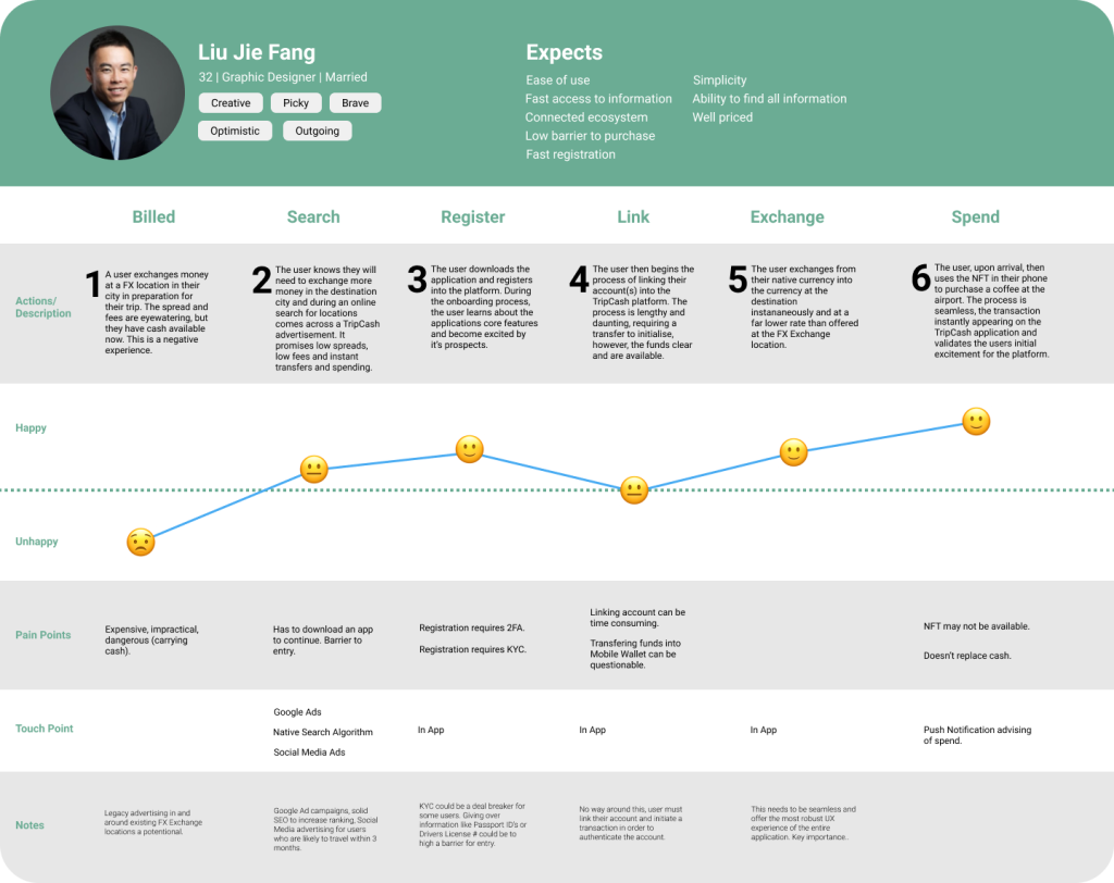
These tools were instrumental in understanding the user experience from multiple perspectives and ensured that our design decisions were grounded in real user needs.
Design
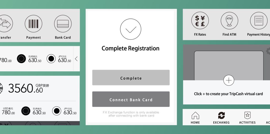
Following this, I created early wireframes to visualise the simplistic layout and functionality. These wireframes served as a foundation for iterative design discussions, allowing stakeholders to provide feedback and collaboratively refine the user interface before moving into more detailed design phases.
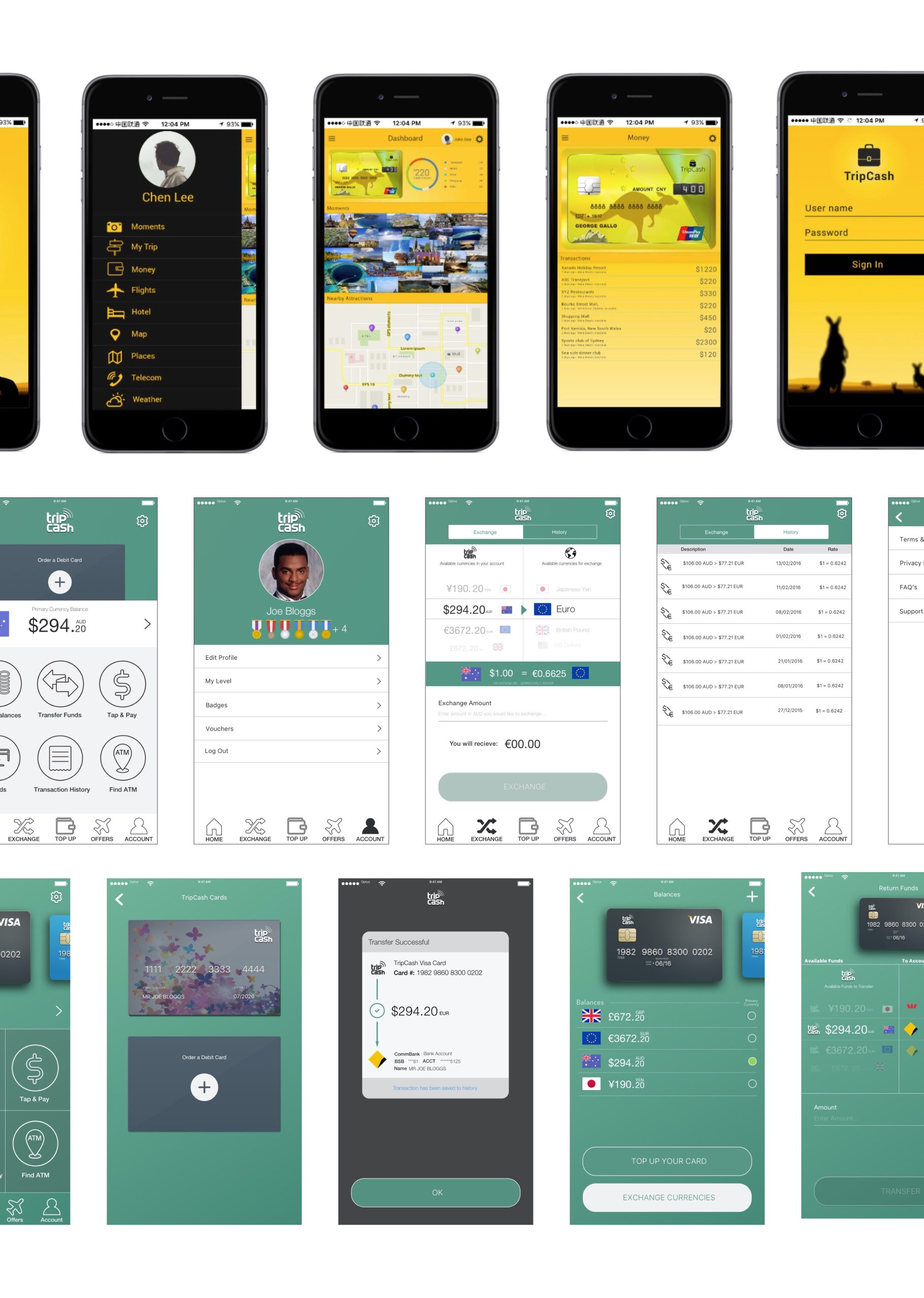
Final Wireframes
The end result of our research and iterative design approach was a well-thought-out, data-driven mobile application design that effectively addressed user needs and business objectives. Unfortunately, I didn’t have the opportunity to see the project come to life, as the startup was unable to retain me following the completion of the final UX wireframes.
